

 Image 1 of 1
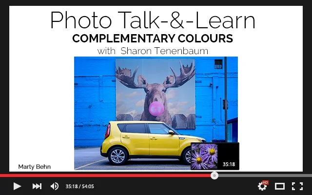
Focusing on hues on using hues opposite each other on the colour wheel—such as blue and orange, red and green, or yellow and purple—to create striking visual contrast and balance. This theme emphasizes the power of colour relationships to draw the viewer’s eye, enhance mood, and add vibrancy to a composition. Photographs exploring complementary colours often highlight how opposing tones interact, making subjects pop against their backgrounds and giving images a dynamic, harmonious energy. It’s not just about colour accuracy; it’s about using contrast creatively to tell a story or evoke emotion.
Focusing on hues on using hues opposite each other on the colour wheel—such as blue and orange, red and green, or yellow and purple—to create striking visual contrast and balance. This theme emphasizes the power of colour relationships to draw the viewer’s eye, enhance mood, and add vibrancy to a composition. Photographs exploring complementary colours often highlight how opposing tones interact, making subjects pop against their backgrounds and giving images a dynamic, harmonious energy. It’s not just about colour accuracy; it’s about using contrast creatively to tell a story or evoke emotion.